
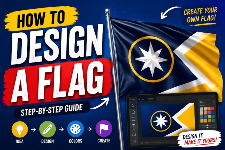
A strong flag can communicate identity in a single glance. It may represent a country, city, school, sports team, business, family, club, campaign, or online community. Unlike a poster or logo, a flag must work while moving, folding, hanging at a distance, and appearing at many sizes. That makes flag design a special discipline: the best result is not simply attractive artwork, but a clear symbol that people can recognize, remember, and feel connected to.
If you are wondering how to design a flag, begin with meaning rather than decoration. Decide what the flag represents, reduce that idea to a few powerful visual elements, and test whether the design still works when details are removed. This guide explains the complete process in practical terms, including symbolism, color, layout, contrast, proportions, digital preparation, and common mistakes.
What Makes Flag Design Different?
A flag is viewed under difficult conditions. It may be high on a pole, partly hidden by folds, reversed by the wind, or seen for only a moment. A complex image that looks impressive on a computer screen can become unreadable outdoors. Small lettering disappears, thin lines merge, and detailed seals turn into indistinct circles. Good flag design anticipates these limitations from the beginning.
The North American Vexillological Association, an organization devoted to the study of flags, summarizes traditional guidance in five well-known principles: keep the design simple, use meaningful symbolism, limit the palette to a few basic colors, avoid lettering and seals, and make the flag distinctive while allowing relevant visual relationships. These are guidelines rather than laws, but they provide an excellent starting point for new designers.
Step 1: Define What the Flag Represents
Write one sentence that explains the flag’s purpose. For example: “This flag represents a coastal town known for fishing, resilience, and sunrise over the eastern sea.” That sentence becomes a filter for every visual decision. If an element does not support the central idea, it probably does not belong in the design.
Next, list three to five concepts that matter most. A community flag might focus on landscape, history, local industry, cultural values, and future ambition. A team flag might express speed, courage, unity, and its mascot. A family flag might draw from ancestry, a shared place, or a personal motto. Rank the ideas so the flag does not try to communicate everything at once.
It is also useful to identify the audience. A civic flag should feel inclusive to residents with different backgrounds. A brand flag may need to match an existing visual identity. A ceremonial flag can support more tradition, while an event flag may be brighter and more energetic. Purpose and audience prevent the design from becoming a collection of unrelated preferences.
Step 2: Turn Ideas Into Simple Symbols
Symbols give a flag meaning without requiring an explanation every time it is displayed. Start by sketching ordinary shapes connected to your subject: a wave for water, a star for aspiration, a mountain peak for landscape, a circle for unity, a sun for hope, or a diagonal band for movement. Abstract symbols are often stronger than literal illustrations because they remain readable at a distance.
Avoid choosing a symbol only because it looks impressive. Ask what it means and whether people connected to the flag will understand or accept that meaning. The same shape can carry different associations in different cultures. Research existing flags, local traditions, and sensitive imagery before finalizing a symbol.
Try combining concepts instead of adding separate icons for each idea. A single white line might represent both a river and a path toward the future. Three connected shapes might represent three neighborhoods and cooperation. This kind of visual economy makes a flag feel intentional rather than crowded.
Step 3: Choose a Focused Color Palette
Most effective flags rely on a limited palette with strong contrast. Two or three main colors are often enough. A small accent color can work when it has a clear purpose, but every additional color makes reproduction more difficult and can weaken visual unity.
Color symbolism should support the story. Blue may suggest water, sky, trust, or stability. Green can represent land, agriculture, renewal, or environmental values. Red often communicates courage, sacrifice, energy, or urgency. Yellow or gold can suggest sunlight, prosperity, achievement, or generosity. White may express peace, openness, snow, or integrity. Black can add strength, remembrance, or visual contrast. These meanings are not universal, so local context matters.
Contrast is more important than symbolism alone. Light shapes should sit against dark backgrounds, and neighboring colors should remain distinguishable in shade, bright sun, print, and digital displays. Test the design in grayscale. If important elements disappear when color is removed, the value contrast may be too weak.
Step 4: Select a Clear Layout
Begin with large divisions rather than small details. Common structures include horizontal bands, vertical bands, diagonal divisions, crosses, chevrons, central disks, cantons, borders, and fields with one dominant emblem. These familiar structures are useful because they organize space clearly and reproduce well.
Build a visual hierarchy. One element should be dominant, a second may support it, and minor features should remain limited. When every shape is equally loud, the viewer does not know where to look. A bold background, one recognizable symbol, and a smaller accent usually create a stronger result than several competing illustrations.
Remember that the hoist edge, the side attached to a pole, is often more visible than the fly edge when wind is weak. Important elements should not be placed so close to the outer fly that they disappear in folds. Designs should also look coherent when viewed from the reverse side.
Step 5: Pick Appropriate Proportions
Flag proportions describe the relationship between height and width. Common ratios include 2:3, 3:5, and 1:2. There is no single ratio that fits every purpose, but 2:3 and 3:5 feel balanced for many custom designs. Choose the ratio early because the same layout can feel very different when stretched or compressed.
Use a consistent geometric system. Align shapes to clear axes, repeat angles where appropriate, and define margins mathematically rather than by guesswork. For example, a circle might have a diameter equal to one-half of the flag’s height, or a diagonal band might have a width equal to one-fifth of the height. Simple ratios make the design easier to reproduce accurately.
Step 6: Sketch Many Variations
Do not stop at the first idea. Create at least ten small thumbnail sketches using only a pen or basic digital shapes. Work quickly and change one major decision at a time: symbol position, stripe direction, color order, background division, or emblem scale. Small sketches reveal whether the concept has a strong silhouette before you spend time polishing it.
Select the three most promising options and simplify each one again. Remove borders, outlines, text, tiny stars, gradients, shadows, and decorative flourishes unless they are essential. Designers often improve a flag more by subtracting than by adding.
Step 7: Test the Flag in Real Conditions
A flag that works only as a large flat image is not finished. Reduce it to the size of a small screen icon. View it from across a room. Print it on ordinary paper and wave it. Mirror it to simulate the reverse. Place it against light and dark surroundings. Blur the image slightly to imitate distance and motion. The basic identity should remain visible.
Test recognition, not just preference. Show the design briefly to several people, hide it, and ask them to describe or draw what they remember. Their answers reveal which elements are doing useful work. If everyone remembers a central star but forgets six small icons, the star is probably the real design and the icons are clutter.
Accessibility matters as well. Use a color-blindness simulator and ensure the design does not depend on subtle differences between similar hues. Strong light-dark contrast and distinct shapes help more people understand the flag.
Step 8: Check Originality and Relationships
Research flags with similar colors and layouts. Complete uniqueness is difficult because flags use a limited visual vocabulary, but your design should not be easily confused with an existing national, regional, political, or organizational flag. Search by color arrangement, symbol type, and overall geometry.
Similarity can be intentional when it communicates a relationship. A city may borrow a color or shape from its state or country. A university department may use the institution’s main colors. The important point is to create a clear connection without producing a near-copy.
Step 9: Prepare a Clean Digital File
Create the final artwork as vector graphics whenever possible. Vector files use mathematical shapes, so they can be scaled from a website icon to a large printed flag without losing sharpness. Keep each color and element on a separate logical layer, use exact dimensions, and remove unnecessary points from paths.
Define colors consistently using HEX or RGB values for screens and CMYK or manufacturer-specific references for print. Physical fabric colors can differ from screen colors, so request a sample when exact matching is important. Export a high-resolution PNG for previews and retain an editable SVG, PDF, or other vector master for production.
Flag Makker can help you explore layouts, colors, and symbols online before you commit to a final version. A browser-based workflow is especially useful during early iteration because you can compare several concepts quickly and share them with collaborators.
Common Flag Design Mistakes
The most common mistake is trying to include too much history in one rectangle. A flag is not a textbook page. Detailed coats of arms, dates, maps, slogans, and lists of symbols may all be meaningful, but they usually become unreadable in motion. Keep the deeper story in supporting materials and let the flag express the central idea.
Lettering is another frequent problem. Text appears backward on the reverse side, becomes hard to read in folds, and may exclude people who use another language or script. A flag should ideally communicate without requiring the viewer to read it.
Weak contrast, arbitrary gradients, clip-art illustrations, thin outlines, and excessive borders also reduce effectiveness. Avoid designing only for social media. The finished flag should work as fabric, print, embroidery, a small icon, and a monochrome reproduction.
A Simple Flag Design Checklist
Before approving the final concept, ask these questions: Can a child draw the basic design from memory? Does every major element have a reason to exist? Are the colors easy to distinguish? Is the flag recognizable when small, moving, or partly folded? Does it avoid unnecessary words and detailed seals? Is it sufficiently different from other flags? Can it be reproduced in one-color or low-cost formats? Do the people represented by the flag understand and support its meaning?
A “yes” to most of these questions indicates that the design is ready for broader feedback. If several answers are uncertain, return to the sketches rather than polishing a weak concept.
Frequently Asked Questions
How many colors should a flag have? Two or three main colors are a strong starting point because they are easier to distinguish and reproduce. More colors can work when the concept requires them, but each color should have a clear role.
Should a flag include a logo? A simple logo may work if it already behaves like a bold symbol. Detailed corporate logos, small text, gradients, and complex marks usually perform poorly on fabric.
What is the best software for flag design? Vector design software is ideal for final production, while an online flag maker is useful for fast concepts and experiments. The most important features are shape control, exact colors, alignment, and export quality.
Can a flag break traditional design rules? Yes. The principles are practical guidelines, not absolute laws. Break them only when the exception strengthens meaning, recognition, or community acceptance.
What size should I design the flag? Design in a standard ratio such as 2:3 or 3:5 and use vector graphics. The artwork can then scale to many physical sizes without losing quality.
Conclusion
Learning how to design a flag is a process of disciplined simplification. Start with a clear purpose, translate the most important ideas into bold symbols, choose a focused palette, and organize the design with strong geometry. Then test it at a distance, in motion, in grayscale, and with real viewers.
The strongest flag is not necessarily the most decorative. It is the one people can recognize, reproduce, and claim as their own. Use Flag Makker to turn your first ideas into visual options, compare variations, and refine the design until every element earns its place.